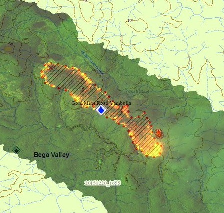
The image above was distributed by the New South Wales Rural Fire Service, showing a map of the Gold Mine Road Fire 17 km southwest of Towamba in the Yambulla State Forest. The map is part of the agency’s Common Operating Picture.
It was apparently obtained by infrared equipment that processed the data in a format we have not seen publicly in the United States. The black lines are most likely the path of the line scanner as the mirror rotated at thousands of RPM in a fixed wing aircraft. It’s interesting that the target discrimination marks (TDMs) only appear at the ends of each line, rather than at every heat source. The intensity of the heat is represented by a range of orange and yellow colors.
The U.S. Forest Service has been mapping fires with infrared equipment for at least four decades, but the folks down under also have very advanced IR systems.


It’s basically their vector map detail that would normally be produced into a map of it’s own. Black hatched lines for burnt terrain and red dots outlining active fire. They would also add detail such as planned back-burn lines, fall back back-burn lines, special notes etc. for fire fighters.
COP has selectable layers for anything they have relevant to an active fire. Though sometimes the vector overlay gets in the way of a good image..
Hi Bill,
I just wanted to pass on a few comments re the Infrared image posted from the New South Wales Rural Fire Service. It’s a few months back, but I have only just come across this article.
The black lines and the red dots you see on the COP display are vector lines / features drawn over the fire image, as another layer from the mapping folk on COP. On these multi-band images there are no Target Discrimination Marks used, as fire of any sort is easily seen.
In Australia, we have focussed on using this type of imagery as it is easily interpreted, and provides a little more detail in fire intensity and post-burn terrain than using just thermal IR.
A few more (untouched) samples can be seen at https://web.facebook.com/Airborne-Infrared-Bushfire-Mapping-411711122237046 if you’re curious.
Cheers…
Thanks Robert. What is the purpose of the black lines and red dots drawn over the fire image by the mapping folk on COP?
Same fire with USNG grid and satellite hotspot data.
Click a hotspot to see GIS attribute data
http://www.mappingsupport.com/p/gmap4.php?usng=55H_GU_2523_7834&tilt=off&z=14&t=h,MODIS_from_ESRI&coord=usng&streetview=off&q=http://www.propertylinemaps.com/p/public_land_map/USA/USA_wildland_fire_3.txt
Joseph Elfelt