Is that risk map current? Depends on the state.

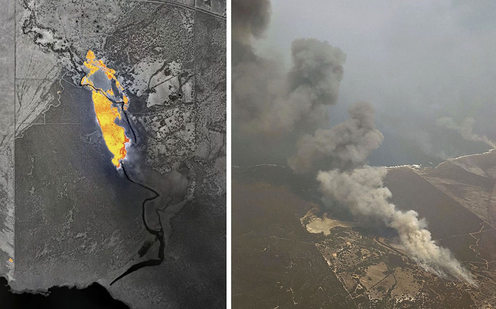
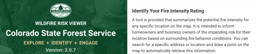
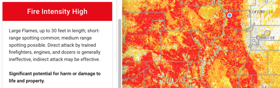
Colorado’s wildfire risk map was so inaccurate that state officials just about ignored it — for many years. The map was outdated, especially in western Colorado, where 3+ million acres of forest was covered in beetle-killed pines.

Carolina Manriquez, a lead forester with the state’s forest service, said they were supposed to use the state risk map, but they knew it was not accurate and therefore couldn’t rely on it. As the E&E News recently reported, an infusion of $480,000 in state funds resulted in a new Colorado map with updates including pine beetle damage and densely populated mountain towns.

Colorado wildfire risk viewer

Including 2017 and 2020, when annual wildfires burned more than 10 million acres, the last decade has marked some of the worst fire seasons in history. The risk is compounded by both climate change and growing wildland/urban interface areas, particularly in the West. Some states — including Colorado, Oregon, Utah, and Texas — have moved toward ensuring their fire risk information and maps are updated and more accurate, displaying areas of highest risk and most in need of prevention and mitigation.

Colorado fire risk mapping

“There is a slowly growing push among different states to do this,” said Joe Scott, founder of Pyrologix in Missoula. The firm provides utility wildfire risk assessment, catastrophe modeling, fuels treatment prioritization and management, and exposure analysis.

To improve wildfire risk maps, many states are partnering with firms such as Pyrologix that can build public-access display of fire risk data and conditions. Using satellite imagery, census information, and other data, advanced tools can  determine locations and ranges of ignition probability and fire intensity, along with threatened resource types. Gregory Dillon, director of the USFS fire modeling institute, says the state-specific maps are not a duplication of federal fire maps, but rather a more refined product.

The Kansas Forest Service unveiled in September its new wildfire risk explorer, a digital interactive map that provides a detailed look at statewide fire risk. The effort began in 2018 after several major wildfires including the 2017 Starbuck Fire, which burned some 500,000 acres and destroyed or damaged more than $50 million worth of livestock, fencing, and other resources.

“A lot of state-led efforts are trying to communicate to  communities and residents about the risk to private property or municipalities,” said Jolie Pollet, wildfire risk reduction program coordinator at the Department of the Interior.

That’s slightly different from federal mapping efforts focused on protecting federal lands, Pollet said. State-focused mapping can assess evacuation routes, encourage homeowners to reduce their  risk, and improve prepared applications for federal grants. State improvements such as those in Kansas also help forestry and fire officials allocate limited resources to focus on the highest priority areas.

Australian company develops system for real time mapping of wildfires

Part of the Holy Grail of Wildland Firefighter Safety

Map of a fire near Vivonne Bay, Kangaroo Island
Map of a fire near Vivonne Bay, Kangaroo Island, Australia, Jan. 9, 2020. FireFlight image.

At Wildfire Today we have often advocated for what we call the Holy Grail of Wildland Firefighter Safety — making available to fire personnel the real time location of the fire and firefighting resources. Several systems for tracking the fire or resources have been demonstrated or used on a small scale by federal land management agencies in the United States. Hundreds if not thousands of law enforcement agencies, fire departments, and private corporations have been using tracking systems for years.

A company in Australia has developed a system to deliver half of the Holy Grail, the real time position of a wildfire. FireFlight Technologies, with CEO Dr. Paul Dare, a long-term South Australian Country Fire Services (CFS) volunteer, has been awarded a $100,000 grant to demonstrate its real time mapping system.

Using infrared thermal sensing equipment in an aircraft it can see through smoke to detect the location of a wildfire.

Below is an excerpt from an article at Cosmos Magazine, January 7, 2022:

…“The other live information we get from the camera system is contextual,” says Dare. “We can see features such as trees, creeks, roads, buildings – even cars. Anyone looking at the map would recognize these features and understand the implications.”

“There are two ways of thinking about it. First, the chief is back at headquarters with a strategic view. They can move a dozen fire appliances from one side of the fire front to the other. This can take hours to achieve.

“Then there are the people on the fire trucks. They’re approaching the fire much more tactically. Their decision making is going to be based on seconds and minutes.”

This summer, Dare’s system will transmit rapidly updating high-resolution images onto a web-based portal. From there, CFS officers can interpret the bushfire’s behavior to reposition ground crews, deploy fire bombers and issue evacuation alerts accordingly.

The technology has already been put through its paces. Data from the sensor was relayed to defense personnel during the 2019–2020 Kangaroo Island bushfires. It’s also been used during recent wildfires in Montana and California.

“We build and supply our own hardware,” Dare said. “We make a set of equipment work together and put it in a box that can be bolted on a helicopter or plane. We give the pilot a portable computer to control it. That way, we know it’s all going to work.”

What’s happening in the United States?

In the US, the John D. Dingell, Jr. Conservation, Management, and Recreation Act required that by March 12, 2021 the five federal land management agencies “…develop consistent protocols and plans for the use on wildland fires of unmanned aircraft system technologies, including for the development of real-time maps of the location of wildland fires.”

While this technology has been demonstrated, real time mapping appears to be far from being used routinely.

The Dingell Act also mandated that the five federal land management agencies “jointly develop and operate a tracking system to remotely locate the positions of fire resources for use by wildland firefighters, including, at a minimum, any fire resources assigned to Federal type 1 wildland fire incident management teams”, due by March 12, 2021.

The US Bureau of Land Management has installed hardware for Location Based Services (LBS) which are now operational on more than 700 wildland fire engines, crew transports, and support vehicles. Vehicle position and utilization data are visually displayed via a web-based portal or mobile device application.

Ten months after it was required by Congress the US Forest Service has made very little progress on this mandate.

Thanks and a tip of the hat go out to Gerald.

New ICS map symbology

Additions to the Incident Command System Standards for Geospatial Operations

Updated April 27, 2022

ICS Symbology 2022
ICS Symbology 2022

(Updated April 27, 2022 to reflect the revisions for 2022)

You may have seen new symbols on wildfire maps this year. That is because the National Wildfire Coordinating Group approved new symbology again, this time for the 2022 fire season.

They were developed by the NWCG Data Management Committee and are now part of the Incident Command System Standards for Geospatial Operations. Many of the new symbols introduced in the last few years are for various types of fireline, such as Planned Hand Line, Planned Mixed Construction Line, Planned Road as Line, Planned Secondary Line, Temporary Flight Restriction, Foam Drop, Retardant Drop, Escape Route, plus — Structure Wrap, Retardant in Avoidance Area, UAS Launch and Recovery Zone, and many more.

Some of the new symbols will be fairly easy to remember. Others, not so much. A map in color will be necessary to easily differentiate a few of them, such as Fence vs. Other vs. Road Repair, and the three types of drops, Water, Foam, and Retardant. Most maps have legends to make the interpretation easier, and ArcGIS Pro has a filter to only display the features used on the map.

The image above is moderate resolution; a high-resolution pdf version (2.9 MB) can be downloaded.

Thanks and a tip of the hat go out to Katei and Steve.

Using maps of fires to communicate with the public

The good the bad and the ugly

Maps are a great way to communicate with a public that may be starving for information about an ongoing fire, or to inform them about conditions that could lead to more fires. They can provide information very quickly — if thoughtfully created.

The two maps below distributed by Geographic Area Coordination Centers (GACC) on Twitter attempt to warn the public about the elevated danger of wildfires caused by actual or predicted lightning. I would venture a guess that the general public would have great difficulty figuring out what part of the country they represent based solely on the images. There are no state boundaries that can be easily identified and no cities or highways to make the guessing game easier. The polygons within the maps (which are not counties on the RMACC map) do not convey any worthwhile information to the casual Twitter user, only adding to the confusion.

I am a harsher critic of maps than most, having spent many fire assignments as Situation Unit Leader and Planning Section Chief, producing maps for firefighters and the public. Map making continues at Wildfire Today, producing graphics to illustrate the location of fires.

When the public sees smoke or they hear about new fires, many of them have one overriding question. Where is the fire? Unless they have property in the area, the typical person does not need to know that the fire is 300 feet west of Forest Service Road 24D3. They also don’t care about division breaks or helicopter dip sites. They need a map so they can figure out, in many cases, where the fire is in relation to them or their community. A map that is zoomed in so tight that the geographical context of the fire can’t be seen, is often not helpful to the public. A person can get oriented more easily if they can see highways and one or more cities/towns/communities. But if the incident is in a very remote area, that can be difficult.

I visited InciWeb today and found some good, bad, and ugly examples. All of the images below were large files that needed to be reduced in size to show here; the original images have more detail.

The map below of the Castle and Shotgun Fires on the Sequoia National Forest appears to be based on the standard Forest Service recreation map that forest visitors can purchase — on paper. It is shaded, which may represent vegetation and/or topography and also includes virtually every Forest Service site or feature that exists, including dirt roads. The result is clutter that unless a person has a high-resolution copy of the image and plenty of time, it is difficult or impossible to find paved roads, highways, or communities that could help a person to get oriented. At least it has a vicinity map at upper-right so we know it is in central California.

The base map used for fire public information maps should not be topographical lines or the standard F.S. recreation map.

Map SQF Complex of fires
Map of the SQF Complex of fires on the Sequoia National Forest, August 28, 2020.

The map of the Griffin Fire below is better. It is zoomed out providing geographical context, and is not cluttered. But much of the very small text is difficult or impossible to read.

Griffin Fire, Arizona
Griffin Fire, Arizona, August 30, 2020.

The map below shows five widely separated fires in Arizona so it has quite a bit of context. It shows many, many dirt roads, but that helps to show the location of the three fires on the east side. I don’t know that the shaded relief background adds value, but it has a vicinity map, which is a plus. Overall, a very good map.

Medicine Fire Arizona
Medicine and other Fires in Arizona Augut 30, 2020.

The map of the P515 and Lionshead Fires in Oregon deserves praise for its simplicity and lack of clutter. The colors showing ownership are all very different from each other, making it simple to compare them to the helpful legend. It is effective and easy to comprehend. The Lionshead Fire is so close to the edge it makes me wonder what is just off the map to the west. Probably more of the same, but still…

(One of my pet peeves is when six similar shades of brown, for example, represent different features. Not a problem on this map.)

P515 and Lionshead Fires in Oregon
P515 and Lionshead Fires in Oregon, August 29, 2020.

The best map that I ran across during my quick perusal of InciWeb today is the White River Fire on the Mt. Hood National Forest in Oregon. The map maker made sure to include at least one community and several highways. They even went the extra step of adding three labels to features with which the public may be familiar. It is pleasing to the eye, has a useful legend, and the highways near the fire are identified. Even though much of the fire is on Forest Service responsibility land, they resisted the urge to use the FS recreation map as a base map.  Great job, White River Fire. (Contact us and we’ll send you a prize, a Wildfire Today cap.)

White River Fire in Oregon
White River Fire in Oregon. August 30, 2020.

Winter task for U.S. and Australia wildfire agencies: create a common operating picture

One source for informing the public and gathering information about mitigating the emergencies, providing relief, managing transportation corridors, electrical power grids, and evacuations

fire map Victoria
Map from Emergency Management Victoria, January 6, 2020.

After the 2019-2020 southern hemisphere bushfire season, emergency management personnel in both the United States and Australia should take the opportunity to evaluate the fire season and determine if there is a better way of distributing information to the public and emergency management agencies.  In neither country is there one key source for information where the public, the media, and the responsible agencies can quickly and efficiently obtain important real-time intelligence and predictive models that they need to make decisions about informing the public, mitigating the emergencies, providing relief, managing transportation corridors, and gathering information about electrical power grids and evacuations.

The military calls this information source a common operating picture (COP).

All of this information is available at hundreds if not thousands of sources, but not everyone that could benefit from the data have access. It needs to be pulled together for safety and efficiency.

In the United States if a citizen needs current information about a wildfire how do they get it? From the county sheriff, local fire department, or a county, state, or federal agency? It makes a difference about where to look if the fire is on federal land, state protected land,  city, county, national or state park. They can try social media, but which application and which account? InciWeb sometimes has information about wildfires managed by federal agencies, but not all. And since law enforcement is responsible for evacuation, InciWeb does not always have current information about the status of evacuations. Information on the website about individual fires may not have been updated for 12 to 18 hours, however some incident management teams are better than others. And InciWeb rarely provides projections of fire spread in a timely manner, if at all. When someone is threatened by a rapidly spreading wildfire they don’t have time to randomly check an alphabet soup of acronyms on dozens of web sites or social media accounts, even if they know the names, handles, or web addresses.

A COP would need to have a sign-in option that would make it possible for authorized personnel to see detailed data that should not be distributed to the whole world, such as exact locations of resources.

Below are examples of fire location information in Australia on January 6, 2020 United States time, in addition to the Victoria map at the top of the page.

Map New South Wales Rural Fire Service fires
Map from the New South Wales Rural Fire Service showing fires that are at the “Advice” level, meaning “A fire has started. There is no immediate danger. Stay up to date in case the situation changes.”
Map in South Australia
Map of fires in South Australia January 6, 2019. From SA Country Fire Service.

The maps produced for New South Wales and South Australia can be more useful upon zooming in, but occasionally they are so cluttered with multiple polygons and symbols that they are difficult to decipher. The Victoria map improves after zooming in, but it tries to include too much information.

The data on these three maps stops at the imaginary line separating the states. This could give someone the false impression that there are no fires just across the state border. If you need information about a location near a state line you need to know how to access the data for both states.

The three Australian states all use different symbology, so an icon or polygon on one map may have a completely different meaning in the neighboring state.

The New South Wales Rural Fire Service occasionally produces detailed maps showing the perimeter of a single fire and the predicted spread, but it is not done on a regular basis and may be difficult to find when it does exist.

But these Australian state maps attempt to include at least some information about all large bushfires in their state. In the United States no agency to my knowledge even attempts this. InciWeb produces a map of the country that shows the location of every fire on federally managed land that is being tracked on the website, but does not include federal fires that are not on the site, or state or locally managed fires.

For both Australia and the U.S. creating a national map for wildfire information would be a great first step toward a common operating picture.

Check out Ellen Broad’s thread on this mapping topic. She has some excellent observations.

New real time mapping system used on Cave Fire

Fire Integrated Real-Time Intelligence System (FIRIS)
An example of an output from the Fire Integrated Real-Time Intelligence System (FIRIS) used on the Cave Fire near Santa Barbara, CA November 26, 2019. The dots with arrows represent weather stations. Inciweb.

A new real time wildfire mapping system was used on the Cave Fire near Santa Barbara, California this week.

In September the Orange County Fire Authority began a 150-day pilot program to use and evaluate the Fire Integrated Real-Time Intelligence System (FIRIS). The program got off the ground thanks to funding secured in the 2019-2020 California state budget by Assemblywoman Cottie Petrie-Norris (D-Laguna Beach).

The system utilizes a fixed-wing aircraft equipped with infrared and radar sensors that can see through smoke. The plane provides real-time fire perimeter mapping and live high definition video to support supercomputer-based wildfire predictive spread modeling.

(Click here to see all articles on the Cave Fire, including the most recent)

FIRIS fire wildfire mapping real time
Screenshot of aircraft featured in the FIRIS B-Roll video.

A supercomputer at the University of California San Diego runs WIFIRE spread projections based on fire perimeter data collected by the aircraft. The output estimates where the fire will be in the next six hours. The fire spread model adjusts for successful fire suppression actions by firefighters on the ground and in the air. This intel allows for more timely and accurate decision making for resource allocation and evacuations.

flight path N4717V fire mapping
The flight path of N4717V, a Turbo Commander 690, also known as “AC90”. It was orbiting over the Cave Fire at 12,400 feet on November 26, 2019. Flightaware map.
AC90 mapping aircraft wildfire
The FIRIS aircraft, shown as “AC90”, was over the Cave Fire along with two S-2T air tankers, at 7:52 a.m. November 26, 2019. Flightradar24

If I am correctly interpreting the WIFIRE product at the top of this article the system predicted that the Cave Fire would grow from 4,994 to 8,880 acres over a 90-minute period beginning at 10:56 a.m. on November 26, 2019. Spot fires were predicted more than a mile ahead. However, decreasing winds that day slowed the spread. A weather station in San Marcos Pass about three miles northwest of the fire recorded sustained wind speeds from 1 to 5 mph between 10 a.m. and 5 p.m. Rain beginning at 2 a.m. November 27 stopped  the spread at 4,330 acres.

Weather San Marcos Pass
Weather at San Marcos Pass, November 26-27, 2019.

The video below is “B-Roll”, that is, unedited footage of the FIRIS system. The first 6.5 minutes are simply images of aircraft, but after that you will be able to look over the shoulder of the imagery technician as he observes infrared imagery of a fire, manually interprets the heat signatures, then traces the fire perimeter on the screen. That perimeter could then be electronically sent to the super computer in San Diego County which would run a fire spread model to predict what the fire will do in the next six hours.

Our attempts to obtain more information about FIRIS from personnel on the Cave Fire that used the system were not successful.